Blog

What should go above the fold in website design?

- Sunday, November 23, 2014

Here at Gloss Creative Media, we often have clients asking us about the importance of ‘above the fold’ when it comes to website design. The prevailing fear of the majority of our clients is that visitors to their brand new website might miss vital information if it is not included above the magical fold. Apparently, if people are forced to scroll beyond the first screen, then they are doomed to miss the information altogether.

While the ‘above the fold’ mentality is a valid, and very popular, concern when it comes to web design, it is one that is often misunderstood. As a result, adhering too strictly to the ‘above the fold’ school of thought can lead to out-dated websites that are difficult for your visitors to use.

So, today we thought we’d clear up the ‘above the fold’ debate, once and for all. You never know, the success of your next website might just depend upon it.

What does ‘above the fold’ mean?

Traditionally speaking, the term ‘above the fold’ actually originated from newspapers. It was used to encapsulate everything that was found in the top half of the front page of a newspaper. It was the most highly sought-after piece of real estate in any newspaper, and was the section that sold a newspaper. So, it had to include all the biggest stories, the sauciest tales, and the most important information for that particular day.

So, the concept is applied similarly to website design. In web design, ‘above the fold’ refers to the portion of the website homepage that a visitor sees when they first land on your site. It is everything that they can see, without having to scroll down even one teeny tiny bit.


Does the fold really impact website design?

According to research undertaken by Nielsen, a mere 20% of website visitors actually read below the fold. However, this information isn’t actually groundbreaking. In fact, as early as the 1950s, David Ogilvy professed very similar statistics: only one in five people ever make it through the headline. And that was way before the internet, and the ‘above the fold’ concept, were even invented. The behavioural patterns of human beings are not magically going to change overnight.

According to KiSSMetrics, the fold (and the information that is placed above or below it) actually has no bearing whatsoever on conversion rates. Rather, it is all about the motivation levels of your website visitor. It is all about how convinced, how motivated they are to continue scrolling, to click through to wherever you want them to. The fold has little to do with it.


So, what should always be included above the fold (if anything)?

While the ‘above the fold’ concept is not as important as it once was, there are still a few conventions that abound, and a very important elements to make sure that you always include in the top half of your website, particularly on your homepage and any landing pages.

First and foremost, you want your website visitors to know whose website they are on, and what it is that your company actually does. A lot of companies do this by including their logo in the top left-hand corner of every page, along with some sort of a tagline. The logo is generally hyperlinked, and when clicked on, redirects users back to the website homepage. So, not only is a logo important in terms of providing information, but it can also be used as a vital navigational tool.

While we’re on the topic of navigation, it is important that you make it easy for visitors to navigate around your website. Again, the convention is that the navigation bar will be included ‘above the fold’ and towards the top of the page. This is the same for any ‘Search’ field or functionality.

You’ll also want people to be able to contact you easily. So, make sure there is a ‘Contact Us’ page in your main navigation or, at the very least, a phone number or email address included ‘above the fold’.

Lastly, you want your website visitors to be able see your most important piece of information quickly and easily, before they click away to the page that they’re actually looking for. So, if you’re having a sale, or have recently won an award, or have a big event coming up, or you’ve launched a new product, then display this prominently ‘above the fold’ on your homepage. While not all of your visitors will pay attention, you’ll capture the interest of some.

And that’s it. Anything more is clutter. Anything more will discourage visitors and will discourage scrolling. Anything more and your website will become quite hostile, particularly for users on mobile devices.

In fact, on average, 30% of people who are accessing websites these days are doing so via mobile devices. And, this figure is only expected to increase over the next few years. On all of these devices, there is no ‘above the fold’. It changes every single time, making the whole ‘above the fold’ concept completely irrelevant.

What to Look for When Checking a Print Proof

- Sunday, November 09, 2014

A print proof is basically a one-off sample of your printing job. It is the very first print of your job, and the closest approximation to the finished product that a printer can achieve. While a print proof will never be exact (particularly when it comes to colour matching), it will be detailed enough to give you one last chance to check everything is correct (and catch any errors) before your file is sent to the printing presses.

If you haven’t had any proofing experience, checking a print proof can seem daunting, particularly if you’re approving a hundred-page document. But, with our advice below, you can hone your proofing skills, and will be much more able to spot errors and inconsistencies.

1. Find a Quiet Space

Everyone is different, and has different habits when it comes to proofing, but we suggest that you grab a cup of coffee and find somewhere quiet. Proofing requires quite a bit of concentration, and can be difficult to do with ringing phone and dinging email alerts. Make sure you take a print-out, or an electronic copy of your print-ready PDF to check your print proof against. Without a copy of the print-ready artwork, you might not notice that something is actually missing.

2. Double Check Digits and Details

It is always a good idea to call any telephone numbers included in your document, and to type URLs into your browser. Triple checking all these obvious, but easily forgotten, details can save a lot of money on a re-print in a week’s time.

3. Keep in Mind that Colour Can be Tricky

If you have opted for an offset print job, it is important to keep in mind that your print proof will usually not be printed on the same stock earmarked for the final set-up. This is due to extremely expensive set-up costs. As such, it is highly likely that there will be some differences in colour between the proof, and the final product. So, if colour is critical to your document, then it might be a good idea to request either a press check, or an ISO proof. These two options will attract additional charges, but it might save a lot of heartache in the long run.

On the other hand, if your job is of the digital print variety, then the colour in your print proofs will be comprised of what is known as the four-colour process (CMYK). As such, if your job requires spot colour, then you can match it using a Pantone swatch sample. In addition, a print proof can usually be supplied using the same stock earmarked for the final print job, making colour matching a bit more accurate.

Another tip when it comes to colour; make sure that neutral colours are properly balanced. So, pay special attention to whites, greys, and blacks. If they show a significant colour cast (so, if the whites have a yellow or blue tint to them, and the blacks and greys have a brown, green or blue tint to them), then the colour settings on the printer could be out of balance.

It’s also a good idea to check the overall reproduction of colour throughout your document. You can do this by focusing on what are deemed ‘memory’ colours, such as blue skies, green grass, and red tomatoes. These colours can often be the hardest to match, given that we instinctively know what they should look like. Chances are, if you’re happy with the ‘memory’ colours, then you’ll be happy with all the colours.

4. Keep an Eye Out for All the Little Things

There are a variety of little things that you should keep an eye out for when checking a print proof, including:
• Page numbers: make sure all the pages are ordered sequentially.
• Page sequencing: make sure that your pages are laid out in the correct order, and that you know what the end product will look like. For instance, if you don’t like printing on the inside back cover of documents, then make sure there is a blank white page inserted.
• Headlines: while you might be able to get away with a small typo in body text, spelling mistakes and typos in headlines are glaringly obvious. So, triple check all your headlines and sub-headings.
• Photos: make sure that all your images are positioned, scaled, and cropped correctly. There’s nothing worse than finding you’ve chopped someone’s head off on page two. Also, make sure that all your images are of a high enough resolution for their size; if any images appear blurry, then it is likely that they are too low in resolution.
• Special printing effects: if you have decided to embellish your print job with spot varnish, embossing, or coatings, then make sure these effects are clearly indicated.
• Bleed and trim: check that the trim and bleed marks on each page are where they should be. Otherwise, you might end up with vital content being cropped out on the final compilation.
• Copy: read through your copy carefully, keeping an eye out for typos and spelling mistakes. This is the last chance you’ll have for any corrections.

5. Enlist a Fresh Pair of Eyes

After looking at the same document time and time again, you tend to start seeing what your mind’s eye thinks is on the page, rather than what is actually on the page. When you know what is coming next, you are more likely to skim over misspelt words or fail to notice missing words. So, it’s always a good idea to ask someone who has never seen the document to give it one last check once you’re finished with it.

6. Clearly Convey and Check Corrections

If you come across anything that you aren’t happy with in your print proof, make sure that you clearly communicate this to your printing company. Clearly circle every flaw, typo, spelling mistake, colour issue, and anything else that seems wrong. If you want quite a few corrections made, it might even be worth arranging for a second proof. Whether your second proof is of the hard-copy or electronic kind, make sure that you triple check that all your changes have made.

How to Make Social Media Work for Your Business

- Monday, October 20, 2014

These days, social media is no longer an optional extra when it comes to marketing your business. Social media platforms enable you to reach a much wider audience, better engage with existing clients, and even land new clients. It affords businesses real-time communication opportunities, within minutes (rather than hours or days). And, social media enables you to engage in meaningful, two-way conversation with your target markets, employees, and other stakeholders. 

Often, the biggest hurdle associated with using social media to promote a business is which social media platform (or platforms) to use. You need to choose the platform that is best suited to your needs, as well as those of your business, and the platform that the largest proportion of your target market is using. So, today, we’ll run through the main social media platforms, providing hints and tips on which will work best for your business.

Facebook

As the reigning social media champion, Facebook has more than 800 million daily active users globally and 13.2 million Australian users. Facebook has been downloaded on three out of every four smartphone devices, and more than 50% of users check Facebook every day. It should come as no surprise then that Facebook is often the most popular (and first) choice for small businesses. 

The biggest user demographic for Facebook is women, aged between 18 and 30 years old. So, if your business is targeting women, particularly young mothers, then Facebook might be the social media platform for you.

If you opt for Facebook, you can create a dedicated business page, through which you can advertise your business, products, and services in a number of different ways. Facebook allows you to share status updates, promote events, run competitions, and even post opinion polls. When it comes to Facebook, users often ‘like’ business pages for special deals and inside info, so make sure that you cater to this need.

However, with Facebook regularly changing the goal posts when it comes to status updates, this social media network can be a little frustrating at times. In order to reach your entire audience, you will need to ‘boost’ or ‘promote’ your status updates. Promoting a post is not overly expensive (starting from only a few dollars), and you can target very specific audience demographics, right down to the interests of Facebook users. 

Twitter

While micro-blogging platform Twitter only has 2.5 million active users per month in Australia (not that many when compared to Facebook), its usage rates continue to grow year-on-year, racking up more than 15% worth of growth in Australia over the last 12 months. In terms of user demographics, there is no real gender disparity, and the 19 to 30 year old age bracket is the most active.

The nature of Twitter (where users are limited to short, sharp bursts of information, limited to 140 characters at a time) makes it quite a different beast to the other social media platforms: news often breaks on Twitter, and users tend to view it as a way to find content quickly. However, Twitter is becoming a more visual platform, particularly with upgrades to make photos and videos easier to embed into its updates. 

The best way to engage with potential and existing clients to Twitter is to participate in chats that are related to your industry, products, or services, and to follow similar brands and industry experts. You can also offer special deals via your Twitter channel. If you decide that Twitter is not for you, then you should (at the very least) monitor Twitter for activity related to your industry and your competitors. 

Pinterest

With the focus firmly on images, Pinterest enables users to create online pinboards. Users can then scour the web for things that they like, or are interested in, and save them to their personal pinboards. Globally, Pinterest has enjoyed rapid growth, recording an 88% growth spurt last year. In terms of demographics, Pinterest is four times more like to be used by women, and both the 18 to 30, and the 30 to 45 year old age brackets are quite active. 

Pinterest is a particularly beneficial social media platform for businesses that sell physical products, providing a visually appealing means by which to showcase them. And, even better, Pinterest users are twice as likely to spend twice as much as users referred via Facebook or Twitter.

To make the most of Pinterest, make sure that you have plenty of compelling, beautiful images on your website, that are easily pinnable, and that link back to your website and online shopping cart.

LinkedIn

LinkedIn has been around since 2003, serving the niche market of the corporate world. LinkedIn’s usage rates continue grow steadily year-on-year, with a 32% rise last year. LinkedIn is used more often by men (but also quite regularly by women), and the 30 to 49, and 50 to 65 year old age brackets are the most popular.

LinkedIn should play a part in the social media strategy of businesses that target the corporate world and high-level business executives, or offer B2B services. And, with LinkedIn’s relatively new self-publishing platform, this social media platform offers a range of ways to engage with potential and existing clients.

Google+

While Google+ has a much smaller audience share than the aforementioned social networks (at just 65,000 active monthly users in Australia), it does offer some strong advantages for businesses. Google+ is more than just a social media platform. It is actually an identity authentication platform, which can help a business rank well in the search engine results. In addition, by creating a local business profile on Google+, your business can appear on Google Maps.

If you decide to use Google+, then make sure that you use ‘Circles’ to separate your connections into leads, existing clients and industry influencers. That way, you can target your actions to meet the needs of each of your audience’s perfectly.

If you’re still not 100% sure which social media platform will work best for your business, ask yourself the following:

  • What social media platform does your target market use most regularly?

  • What sort of products or services are you selling?

  • What sort of content do you intend to distribute via social media?

  • Will you use multiple social media platforms, or just focus on one?

  • What is your budget (in terms of cash and man hours) for social media?

Top Tips for Amazing Business Cards

- Monday, October 06, 2014

So many business owners overlook the value of professional business cards.

Think about it. Business cards are so often the first piece of branded collateral that prospective clients receive from a company. It might just be a teeny, tiny piece of paper, but you have the opportunity to make a strong, lasting, positive first impression on a client. As long as you have professional business cards, that is.

There are plenty of inexpensive DIY online business card design and printing companies promoting their wares. The problem is: the end product delivered by these DYI-ers can sometimes be less than optimal. It is easy to spot a cheaply produced business card. Tell-tale signs include flimsy stock, amateurish design, missing important details, and blurred or smudged ink.

If your business cards are sporting any of these tell-tale signs, what message are you sending to prospective clients? Are you really doing yourself, and your brand, any favours by passing out cheap and nasty business cards? What image do you think people will take away of your brand, your company, even you personally?

Cheaper isn't always better when it comes to first impressions. Instead, give clients a great first impression with our tips and tactics for amazing business cards.

Tip #1: Enlist the Help of a Professional Designer

Unless you are a graphic designer yourself, enlist the help of a professional graphic designer. Leave design to the experts – it’s what they were trained to do.

Tip #2: Design Your Business Card in Line with the Rest of Your Marketing Collateral

This follows on from tip number one. If at all possible, don’t have your business cards designed in isolation from all your other marketing collateral. You should always work towards building a consistent feel across all your branding. So, your business cards should match your brochures, your website, your letterhead, your email signatures. You want your clients to recognise, and resonate with your brand instantly. For instance, we all intuitively know what golden arches and a bright red soft-drink can symbolise. Consistency is key to brand recognition.

Tip #3: Keep the Design Simple

Business cards are usually around 9 cm x 5 cm. Quite small. Not a huge amount of space to work with. So, don’t try to jam unnecessary content into the small area. Don't make your logo too large, and don’t include extra, unnecessary graphic elements.

Tip #4: Make Sure It’s Easy to Read

Following on from tip number five, make sure that your clients can actually read the important contact details listed on your business cards. So, don't make the type too small, and don't be afraid to use white space around the important information. Ensure that the colour of the font can be read easily, particularly if you opt for a dark or coloured background (for instance, red and yellow can be quite difficult to read when overlaid on particular shades of grey). Above all, don’t sacrifice space (that should be used for your contact details) for unnecessary graphics or enormous logos.

Tip #5: Don’t Get too Creative

We know that you want your business card to stand out from the crowd. But make sure that it stands out for all the right reasons. Don’t get too creative. For instance, a card in the shape of a triangle will stand out, but it won’t fit in (to a standard business card holder). More likely, it will end up in the bin. Stick with smaller creative tweaks; maybe a rounded corner, some embossed writing, or a splash of spot gloss.

Tip #6: Use Quality Stock

Human beings are naturally quite tactile beings. So, use a quality stock: one that isn’t too flimsy or bendy; one with a little bit of weight to it. Using quality stock makes your business card feel like a premium product, not a cheap and nasty knock-off.

Tip #7: Make Sure You Include All the Important Details

When it comes to business card content, there are some non-negotiable items. You must have your name, phone number, and email address. Company logo and website are also really important, followed by your position or title, postal address and social media handles (if that’s your bag).

Tip #8: Use the Reverse for Non-Crucial Details

It’s often a good idea to reserve the back of your business card for less important information. Maybe your company logo and website feature on the reverse. It can be quite handy to keep the reverse of a business card clear. Oftentimes, you can use it to write pertinent details on for specific clients.

How to Get the Most Out of Your Client Database

- Sunday, September 21, 2014

Looked after properly, your client database can be one of your most valuable assets, and one of your most powerful marketing tools. It can be essential when it comes to fostering relationships with your existing customers, expanding your business with repeat sales, and keeping track of new leads and potential clients.

Given all these wonderful possibilities, it is vital that you don't let your client database waste away, gathering mothballs in the corner. Regardless of whether you use it for eNewsletters, event invitations, or for addressing Christmas cards, it's vital that your client database is always as up to date as possible, and contains relevant, specific notes.

Keep Your Information Simple

One of the best ways to ensure that you keep your client database up to date is to make it simple to manage, right from the word go. Avoid including unnecessary information when you first establish your database. The more information fields you have to complete and update, the more likely it is that you won’t. For instance, if you haven’t had a fax machine for the last ten years, chances are, you don’t really need to include a field for fax numbers.

Standardise. Standardise. Standardise.

Another tip for setting up your database; make sure that you standardise the all the information it will contain. Establish standard rules and regulations around the formatting of data. For instance, will names be listed as Fred Jones, F. Smith or Smith, Fred? Will phone numbers be expressed as 02 9876 5432 or (02) 9876 5432? These tiny differences may seem insignificant, but they can make a big difference, particularly when it comes to duplicate entries.

Restrict User Access

Depending on how big your company is, restricting user access can make life much easier. If all of your 250 employees can edit the information included within your database, there is simply no way to control accuracy. Instead, make updating data the responsibility of just a handful of people. While all your employees should be able to access the information contained within the database, they shouldn’t all be able to change that information.

Capture Social Media Contact Details

If you haven’t already considered it, then think about capturing social media contact details. With the ever-growing use of social media as a mainstream communication channel, this type of information can be invaluable. So, configure your database to capture Facebook page URLs, Twitter handles, Google+ profile pages, and LinkedIn addresses. That way, next time you are about to email a client, you can take a quick look at their social media accounts, and congratulate them on any recent announcements.

Communicate Regularly

There’s no point in having a client database, and making sure all of the data included within is up-to-date, if you don’t use it. So, make sure that you stay in touch with the clients listed in your database, even if it’s just the occasional friendly message or advice article. Sharing something for nothing can win over the trust of potential leads much more quickly than a hard sell. Invite the people included in your database to touch base with you, or your employees, with their questions and queries. Staying in touch keeps you top of mind, and more likely to win work.

Avoid Constant Selling

While we’re on the topic of touching base with your clients, avoid selling to the contacts in your database all the time. The hard sell gets really old, really fast, particularly these days when people are so commercially savvy. Instead, send your database useful information that informs, educates or entertains.

Undertake Regular Audits

If you want to be 100% certain that your database is chock full of relevant content, then you should undertake regular audits. We suggest doing this at least twice a year. Take the time to filter through, and double check, all the information contained within your database. And, always add a note to every entry indicating the date on which it was last updated. This will save any double-ups. On average, a neglected database is likely to become worthless within three years, particularly given the higher rates of employment turnover these days. So, regular database audits could be an investment that is worth your while in the long run.

Hire a Professional

If all else fails, or if you really don’t have time to go through and manually check every record in your database, then it might be time to call in the professionals. There are plenty of professional data cleaning companies out there; a quick Google search will return plenty of results.

How to Get the Most Out of Your Designer

- Sunday, September 21, 2014

If you’re a small business owner or operator, then chances are you’ve had to work with some sort of a designer along the way. Maybe a web designer? Or a graphic designer? Regardless of what sort of designer it may be, the road to design success may have been somewhat rocky. Miscommunication, or misunderstandings about project scope are common complaints when it comes to relationships with designers.

So, to help you overcome these issues in the future, we thought we’d put together some advice on how to get the most out of your web designer or graphic designer. Our tips and tricks should help keep both you, and your designer, happy and help ensure an optimum outcome for all parties involved.

1. Do Your Research

Before you even think about picking up the phone and engaging the services of a designer, do your research. The more research you do ahead of time, the smoother the design process will be. Pinpoint the sort of designs that you like. Have a few website examples, logos, and graphics that you like on-hand. The list doesn’t have to be too extensive (after all, your designer will come to the party armed with some creative genius). But, if you can provide a starting point for your designer, then the first draft of your designs are much more likely to capture your brand essence and personality. Another tip (when it comes to research) is to peruse your designer’s portfolio. Make sure that there is a few designs included that match the look and feel you’re after. And then highlight these to your designer during your design brief.

2. Be Realistic About Price

Once you have decided upon your designer, it is always a good idea to ask for a ballpark estimate. Once you get this estimate, you need to be realistic about what it is that you are expecting to be delivered. You simply aren’t going to receive a high-end, custom hand-drawn $1,500 logo if you’re only will to pay $150. More is always possible, but it just means that you have to be willing to pay for the service. Everyone’s time is valuable.

3. Have Some Idea of What it is that You Want

As mentioned in our first tip, if you have a little bit of an idea of what you want before you hire a designer, then it will save you both money and time in the long run. Generally speaking, the more versions, and the more edits that a designer has to make, the more expensive the project will be.  

4. Agree on the Scope of the Project

If it’s not 100% clear at the outset of the project, then make sure that the project scope is agreed upon as early as possible. Make sure that you know what’s included in the quote, including the number of revisions. Agree upon the delivery date. Know who is responsible for which outputs. Work out a contingency plan if delivery dates are missed. Clarify the payment terms and turnaround times. Make sure that you are both on the same page from the beginning; it will save disagreements and issues down the track.

5. Expect to Pay More if You Change Your Mind

If you get halfway through the project, and then decide that you’re not 100% happy, or that you’d really prefer something completely different, then unfortunately, you do need to expect to have to pay more. While most designers, including the team here at Gloss, are keen to provide exceptional customer service, we have invested time and money and do need to be compensated.

6. Provide Constructive, Specific Feedback

If there is something that you’re not keen on, let your designer know. But, as much as possible, try to pinpoint exactly what it is that you don’t like. Feedback like, “It needs to pop more”, or “I thought it would have more wow factor” is really difficult for designers to work with. Instead, try feedback like, “I don’t like the colour – it’s a bit too dark” or “It looks a bit crowded, can we introduce some more white space”. Your designer will love you for it!

7. If Your Designer is Great, Share the Love Around

As small business owners and operators, we all know that word-of-mouth is the best possible advertising around. So, if you are super happy with your design job, then make sure you recommend your designer to all your friends, colleagues, and family members. You never know, you might even get a discount next time around.

Does My Business Really Need a Style Guide?

- Friday, September 05, 2014

If you’re a small, or even a medium, business owner, chances are that at some point you’ve wondered whether you really need to have a Style Guide. Given that your team is quite small, and you approve all marketing collateral yourself, you might think that you simply have no need for one.

Before you move the whole Style Guide thing into the too hard basket, ask yourself the following questions. Do you have a logo? Do you use certain colours? Are there particular branding elements or words that you avoid at all costs? If you answered yes to any of these questions, then it’s probably time to put pen to paper and develop your style guide.

What is a Style Guide?

A Style Guide is one single source of all information that is related to your brand. Think of it like the blueprint, the master plan for your brand. It should be the go-to manual when it comes to your brand, and all of the communications and marketing material that your brand produces.

All of your employees should have access to, and should follow, the content contained within your Style Guide. This way, the consistency of your brand is maintained. And, brand consistency fosters brand strength. Think about any of the world’s largest brands. They are always, 100% consistent. There’s Cadbury’s unmistakable shade of purple. McDonald’s distinctive red with the yellow arches. Nike’s swoosh. Apple’s apple. They are instantly recognizable, all around the world, because they are always the same.

A Style Guide formalises this consistency. It provides guidance to all employees, which can be especially helpful if your company is spread out across multiple offices, states, or even countries. A Style Guide can be invaluable if you outsource graphic design or marketing work to external contractors. By perusing just one simple document, your contractors know exactly what they can and cannot do when it comes to your brand. Similarly, if you have a change of employees within your marketing department, a Style Guide will help ensure ongoing consistency, regardless of who is sitting in the chair.

What Should I Include in My Style Guide?

So, have we got you over the line? Are you ready to put pen to paper and create your comprehensive brand Style Guide? If you are, here a few tips on the type of content that you should cover:

  • Brand Message: it’s always a good idea to open your Style Guide with an overview of your brand message. What exactly is it that your brand stands for? What are the values most important to your brand? What are your mission, and your vision, for your brand?
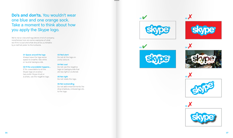
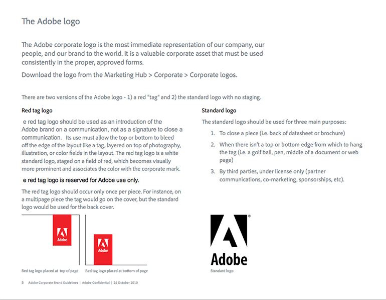
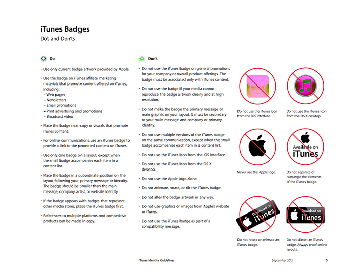
  • Logo Treatment and Usage: your logo is arguably the most important element of your brand. So, make sure that you take measures to protect its integrity. Your Style Guide should include various treatments of your logo (black and white, monochrome, grey scale, horizontal, vertical) and where and how these variations are acceptable for use. It should include minimum size restrictions, as well as any requisite surrounding white space.
  • Tagline: if your company has a tagline, include a dedicated section for it. Outline how, and when, it can be used.
  • Brand Colours: make sure you have a section on the colours that can be used in any company collateral. Generally, these will be the colours of your logo. It is best practice to include all colour types (CMYK, Pantone, and RGB). If you have secondary colours (that perhaps aren’t featured in your logo), then include these as well.
  • Typography: if there are particular fonts that you prefer to use, then slot them right on in. Keep in mind that you may have different fonts for different applications; the range of fonts available in graphic design software packages (such as InDesign) far outstrip those available in Microsoft’s products. So, make sure that you cover all bases.
  • Templates: if you have pre-approved company templates, then include all of these (along with usage instructions) in your Style Guide. Templates could include (but are in no way limited to) letterheads, report templates, PowerPoint presentations, email signatures, other stationery, and business cards.
  • Tone of Voice: it useful to include an overview of the tone of voice that you want used in all marketing and communications material. Do you want your brand’s voice to sound like that of a trusted friend? A polished professional? A technical guru?
  • Language Styles: including a section on language styles can help iron out any wrinkles when it comes to content creation. In your language style section, you should include elements such as spelling, punctuation, numbers, abbreviations, and capitalization.
  • Target Audience: if you really want to dig a little bit deeper, you can even include a section on your brand’s target audience. Provide a description and a persona for whom it is that you are trying to reach with all your marketing and communications material.

Examples of Brilliant Style Guides

Apple i-Tunes: http://www.apple.com/itunes/affiliates/resources/iTunesIdentityGuidelines.pdf

Skype: http://issuu.com/bondo/docs/skype_brand_book_-_look

Adobe: http://brandcenterdl.adobe.com/Corpmktg/Brandmktg/Campaign_Assets/guidelines/corporate/corporate_brand_guidelines.pdf

If all this sounds a bit daunting, or a bit restrictive, just remember, nothing is set in stone. Style Guides are always evolving, always changing. Even at the world’s biggest brands. Be prepared to develop your Style Guide as your brand develops. By developing your brand, your keep loyal customer on-board: they don’t want to see your brand stagnate. For instance, ANZ (one of Australia’s top four brands) launches a brand refresh every two years, changing and updating their logo and branding so that it stays on trend. If it’s good enough for ANZ, then it’s good enough for us!

Do Customer Loyalty Programs Work Anymore?

- Wednesday, August 20, 2014

In a bid to strengthen relationships with customers, companies often embark upon a customer loyalty programs. But just how effective are these programs? Given their popularity (every company under the sun seems to have a VIP membership card these days), it can be often be difficult to achieve any kind of cut-through or competitive advantage with a customer loyalty program.

In fact, a recent study by McKinsey of more than 55 companies across America and Europe, suggests that customer loyalty programs don’t pay dividends. According to McKinsey, companies that have a visible customer loyalty program actually grow at the same rate (or even slightly lower) than companies without one.

Despite these figures, well-thought-out and properly implemented customer loyalty programs can drive long-term value. Customer loyalty programs that actually work all tend to have a few things in common:

They build partnerships:

successful customer loyalty programs are often those that have a broader value proposition, and are implemented in partnership by multiple brands. For instance, one of the reasons that flybuys, Australia’s most popular loyalty program, is so successful is because customers can collect points at multiple retail outlets. The program covers Coles, Telstra, Target, Kmart, LiquorLand, Jetset, Budget, and even Best Western.

They address their customer’s pain points:

to have any chance of success, customer loyalty programs need to address, and solve, the problems of their customers. They need to provide real benefits, a tangible reason to join. Amazon does this exceptionally well. By becoming a member of Amazon’s customer loyalty program (which costs $79 per year), you are afforded free, two-day shipping.

They reward expenditure:

the best, and most engaging customer loyalty reward dollar spent at the cash register, in lieu of any other factor (such as frequency of visits). Priceline’s Sister Club does this really well: members earn one point for every dollar they spend. Once a Sister hits the 100 point mark, she gets a 3% discount. Once she reached the 100 point mark, the discount increases to 4%.

They offer multiple redemption schemes:

truly great customer loyalty programs recognise that their customers are all different, and value different types of rewards. As such, they offer different rewards and options for point redemption. The Woolworths Everyday Rewards scheme is quite effective when it comes to this. Members can redeem points for a $20 gift card every three months, use points towards Qanatas holiday services, or cash points to purchase more than 3,000 different products.

They focus on benefits specific to each customer:

we all know that companies with customer loyalty programs capture data on us; what we buy, how often we buy it, when we buy it. So, why not use this data to tailor customer loyalty programs, particularly if your customers are online shoppers? Offer customers discounts or two-for-the-price-of-one offers on items that they regularly purchase. Chances are, your customers will remember discounted prices on frequently purchased items, and buy from you specifically for them.

They have tiered membership layers:

giving extra rewards to your biggest spenders can be extremely lucrative. Your most generous customers feel looked after, and even more inclined to part with their hard-earned cash. And your other customers might even spend a smidgen more, in order to move up the tiers.

Above all, before you consider introducing a customer loyalty program, you would be wise to fully cost it (including development, marketing, and any ongoing costs). Once your cost analysis is done, compare the costs with a realistic assessment of the benefits of the program. These benefits should be real business benefits (like bottom-line improvement), not simply the bolstering of relationship marketing. If the benefits outweigh the costs, then implementing a customer loyalty program that integrates the six key factors above should be quite successful.

SEO Tips to Improve Your Google Ranking

- Friday, August 08, 2014

Take it from us; you don’t have to be an SEO expert to improve your website’s search cred these days. There is any number of search engine optimisation tactics that you can implement without needing to have a comprehensive understanding of all the nitty, gritty technical details. You will need a broad understanding of the basics though. So, without further ado, we bring you basic SEO tips to improve your Google ranking.

1. Do your keyword research

Search engine optimisation is all about making sure your website ranks as highly as possible in Google’s search results when specific terms are entered. So, it should come as no surprise that your first port of call should be to determine what the most popular search terms for your business actually are. The easiest way to do this is to use the Google Keyword Planner tool. You can use this tool in a couple of different ways:

  • Input the URL of your website into the tool, and then review the suggested keywords that Google provides. It can often be helpful to enter the URL of a couple of your competitors (that are ranking well) as a comparison.
  • Search for particular words, or groups of words, related to your industry to determine keyword suggestions as well as search volume. For instance, if you are a painter, you might enter the words ‘painter’, ‘decorator’, ‘house painting’, and so on.

2. Optimise your website content for these keywords

Once you have completed your keyword research, and know which keywords for which you would like your website to rank, include these in your website copy. Try to include keywords in your headings, as well as in body copy. A word of warning though: don’t overstuff keywords. You don’t want to end up with your website looking spammy, and putting people off. Don’t use the keyword phrase, its variation or a synonym more than four to five times per page. After all, you want to appeal to both the search engines and real, live human beings.

Keep in mind that it can actually be easier to rank for long-tail keywords (phrases that have three, four or five words) as opposed to shorter keywords. Shorter keywords are usually a lot more competitive. For instance, if we take the example of the painter, it will be near impossible to rank for ‘painter’ or ‘decorator’. However, a long-tail keyword, like ‘painter and decorator in western Sydney’ might be slightly easier.

3. Make sure that all your basic on-page SEO is done

There are a few basic on-page search engine optimisation tactics that should always be implemented, including:

  • Title tag: many experts consider this to be the single most important element of SEO. In laymen’s terms, a title tag is the page title (although the two don’t actually have to be the same). The first 64 characters of a title tag appear in a Google search result. So, make sure that you include your keyword as close to the beginning of your title tag as possible.
  • Meta description: this is a 160 character long description of the content contained with the particular web page to which it is related. This also appears in Google’s search results. Use the meta description to convince your audience to click on your website. Don’t simply summarise the page content; that won’t compel anyone into clicking.
  • The H1: this is the headline for your web page. Every page should include only one H1, which includes your keyword and entices your audience to continue reading.
  • Alt tags: these are descriptions that appear when you hover your mouse over an image. The alt tag, and the image file name, for every image on your website should contain your keyword or a variation thereof.

4. Produce great content

One of the most fundamental techniques for improving your search rank is to regularly produce and publish great content on your website, usually through a blog. In doing so, you give the search engines a reason to revisit and reindex your site on a regular basis, pushing it up the SERPs. Not only that, you give your audience a reason to regularly visit and click on your website, which also pushes it up the SERPs. If your content is of a really superior quality, you might even find that other websites, companies, and bloggers refer to your content, inserting backlinks into their own content. These backlinks also improve your search engine rank. It really is a win-win situation.

When it comes to crafting content, try to be as strategic as possible about your editorial calendar. Use your keyword research to build out a schedule of blog posts, with each one focused on a particular keyword. Then measure the results. Keep track of which type of blog post attracts the biggest audience, the highest sharing rate, the most positive comments. Then, write more of these blog posts.

5. Use social media

Google is becoming more and more intuitive and investigative. It can now track how effectively you, and your website, interact with the rest of the online world. Like it or not, Google keeps track of your likes, comments, shares and +1s. The more active you are on social media platforms, the higher your search engine ranking is likely to be.

6. Measure and monitor

Make use of the array of free, online tools that Google has to offer. Take a look at Google Analytics as well as Google Webmasters tool. These will report on how much traffic your website is receiving, which keywords are generating the most traffic, what your audience is doing once they actually land on your site, which pages are the most popular, which pages are most effective in terms of conversions. All this free data is right at your fingertips. Use it to continually improve your search engine optimisation tactics. 

Tailoring Your Website to the Seven Stages of the Customer Buying Cycle

- Friday, July 25, 2014

While the customer buying cycle will naturally vary from customer to customer, it is usually comprised of seven stages: awareness, interest, consideration, purchase, support, loyalty, and advocacy.

Not surprisingly, you need to tailor your online presence, and the functionality of your website, to support each stage of the customer buying cycle. We’ll take a look at each stage, and the most appropriate way to use your website, in turn.

1. Awareness

As the name suggests, the awareness stage is when potential customers become aware of your brand, your company, your products, and your services. It is also the stage during which they become aware of the problem or pain point that they need to address.

During the awareness stage, you need to use the content on your website to attract the attention of potential customers. Ensure that your content talks directly to their problem, that it addresses their pain points. Make sure that your website content is crafted to encourage potential customers to move forward; it should demonstrate that you can provide exactly the right solution for them. It can often be useful during the awareness stage to use landing pages; smaller, stand-alone pages of content, tailored to specific customer needs.

2. Interest

During the second stage, the interest of your potential customer in your products and services increases. They will want to learn more about what exactly you have on offer, and how exactly it can help them. They will want to understand the features and benefits of your products and services, and perhaps even your pricing structure.

Your website can assist enormously during this stage, by thoroughly educating potential customers. The best way to educate customers through your website is to incorporate a blog, featuring regular articles that demonstrate your authority in your chosen field. You can also offer free, downloadable whitepapers or e-books, in exchange for contact information.

3. Consideration

Depending on the products or services you have on offer, this stage may not be appropriate, or necessary. However, if you can offer your product (or part thereof) on a trial basis, it can often help boost the likelihood of lead conversion. For instance, if you supply some type of product is as promised, this type of offer will often put any lingering customer concerns to rest.

If your product or service is not suited to a trial offer, this stage may be replaced with late opportunity negotiation, or, in the case of a large contract or sale, a smaller product or service may be purchased first.

During this particular stage, it is useful to have content readily available to answer any questions that your potential customers might have. So, a list of regularly asked FAQs can come in handy, as well as a dedicated online help desk or phone number. It is especially important that content during this stage fosters engagement with your product or service, and builds customer habits. It is also important to track customer conversions during this stage. Knowing if, and when, content is being engaged with, and which customer convert, can help you improve your processes for future campaigns.

4. Purchase

Arguably the most important stage, this is when all your hard work and dedication pays dividends. Your potential leads convert into actual, real-life customers. Your website needs to facilitate the purchase process in the easiest, most streamlined way possible. If you have an online checkout system, make sure that it works properly, is user-friendly and intuitive.

5. Support

This stage is all about after-sales care. Your customers should receive support and help so that they get the most out of your products or services. This stage is all about ensuring customer satisfaction. Your website plays a vital role during this stage. Use it to host tutorial blogs and instructional videos, customer forums, and a help desk. Happy customers become repeat customers, and are much more likely to refer your products and services onto others.

6. Loyalty

If you have handled the support stage well, this should naturally flow into the loyalty stage. During this stage, you should be able to build successful, fruitful, long-term relationships with your customers. Relationships that result in repeat business, up-selling, and cross-selling. You might offer annual subscription or maintenance plans, or discounts for bulk expenditure. Again, you can use your website to facilitate this type of up-selling and cross-selling. E-marketing combined with specific, targeted landing pages can often work quite well to further engage loyal customers.

7. Advocacy

Last, but by no means least, we come to advocacy: the stage where your customers refer you to all their friends, family, and colleagues. Your website, and its content, should be designed to make referrals easy. So, make sure you have social media sharing buttons on all your website pages, on your blog posts, on your e-newsletters. It can often be useful to offer discounts for referrals (for either new or existing customers).